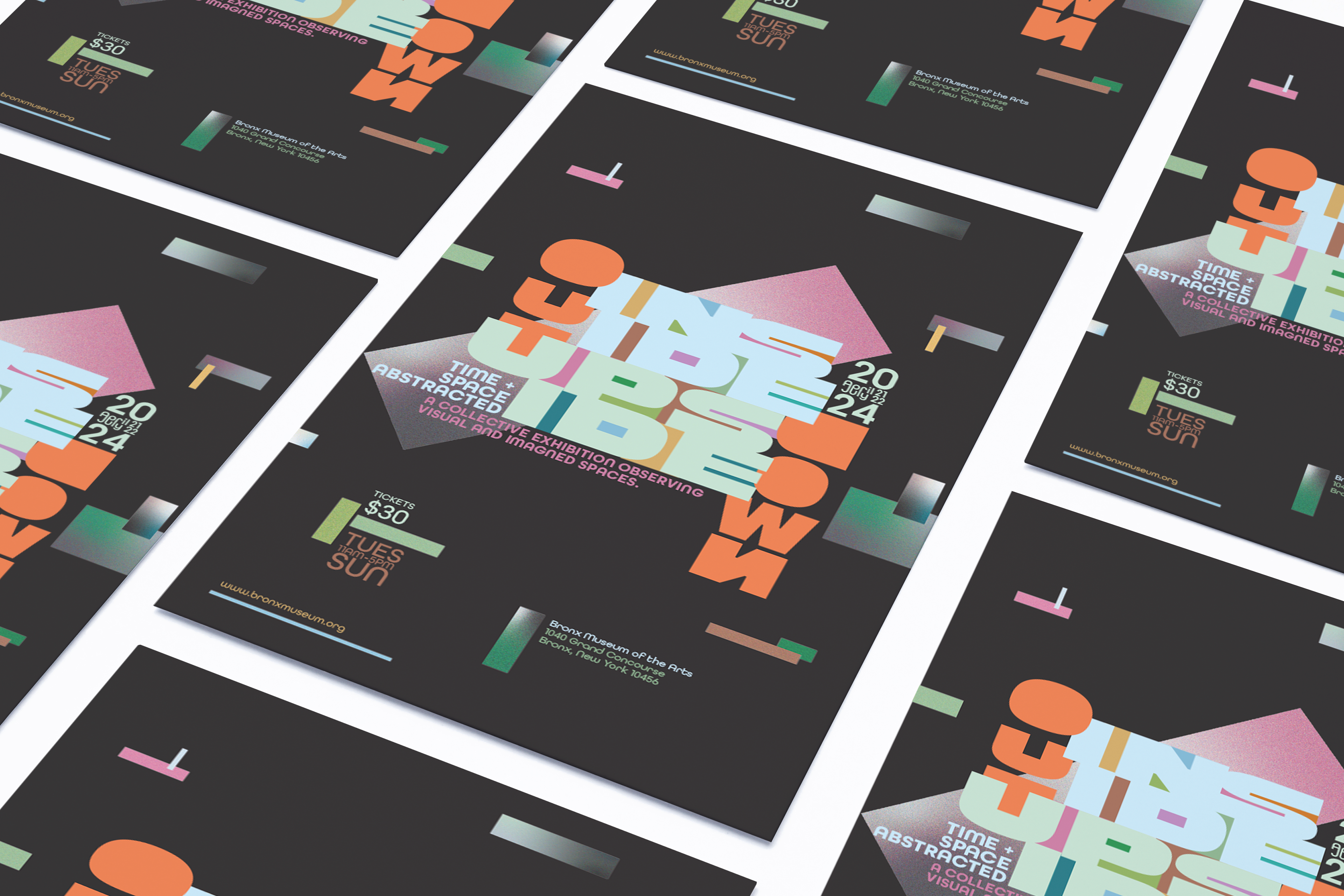
Tasked with designing for a prospective abstract art exhibition at the Bronx Museum of Arts, expressive typography was used to emulate the themes surrounding the phrase "Inside out, upside down." The overall design, including the vector shapes, colors, gradients, and grain, was chosen to represent the themes of abstraction, time, and space. The vector shapes floating in the black background were used to mimic the feelings of space and transport the viewer into a new reality. The necessary information in the flyer was designed to be easily legible and compartmentalized for the viewer while still being integrated with the rest of the design.

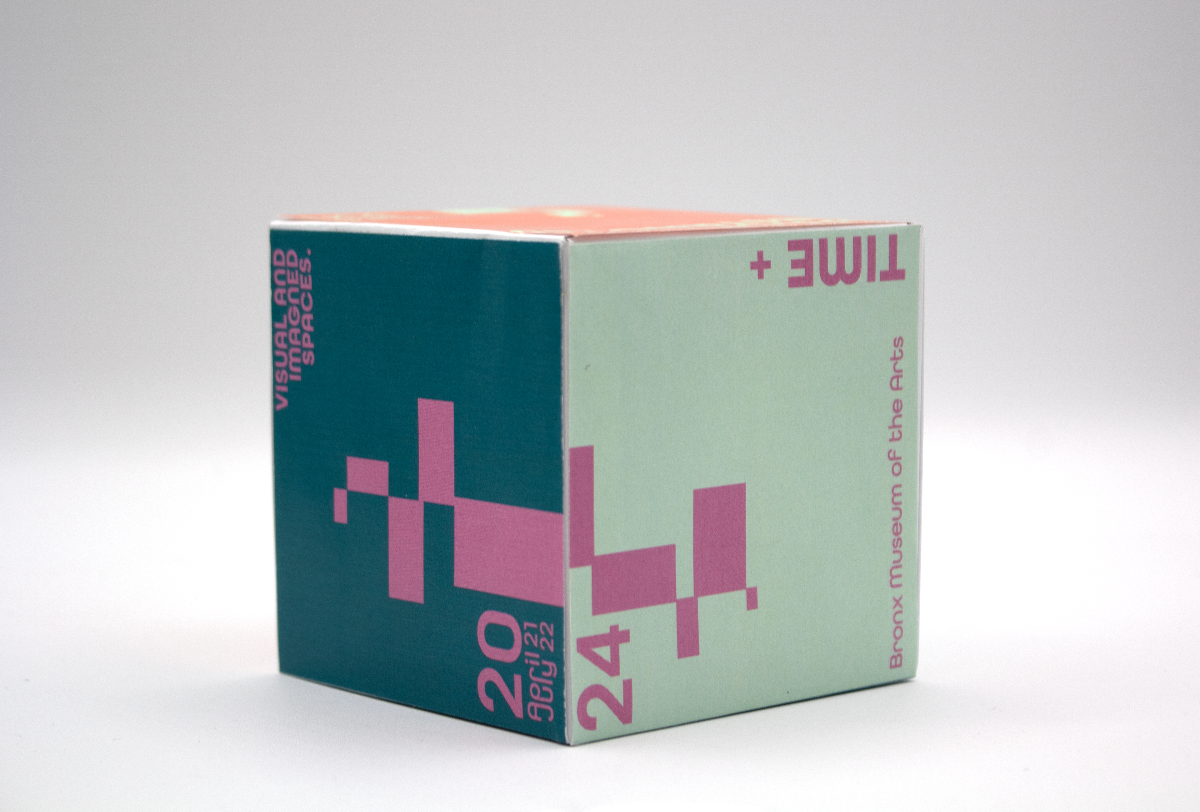
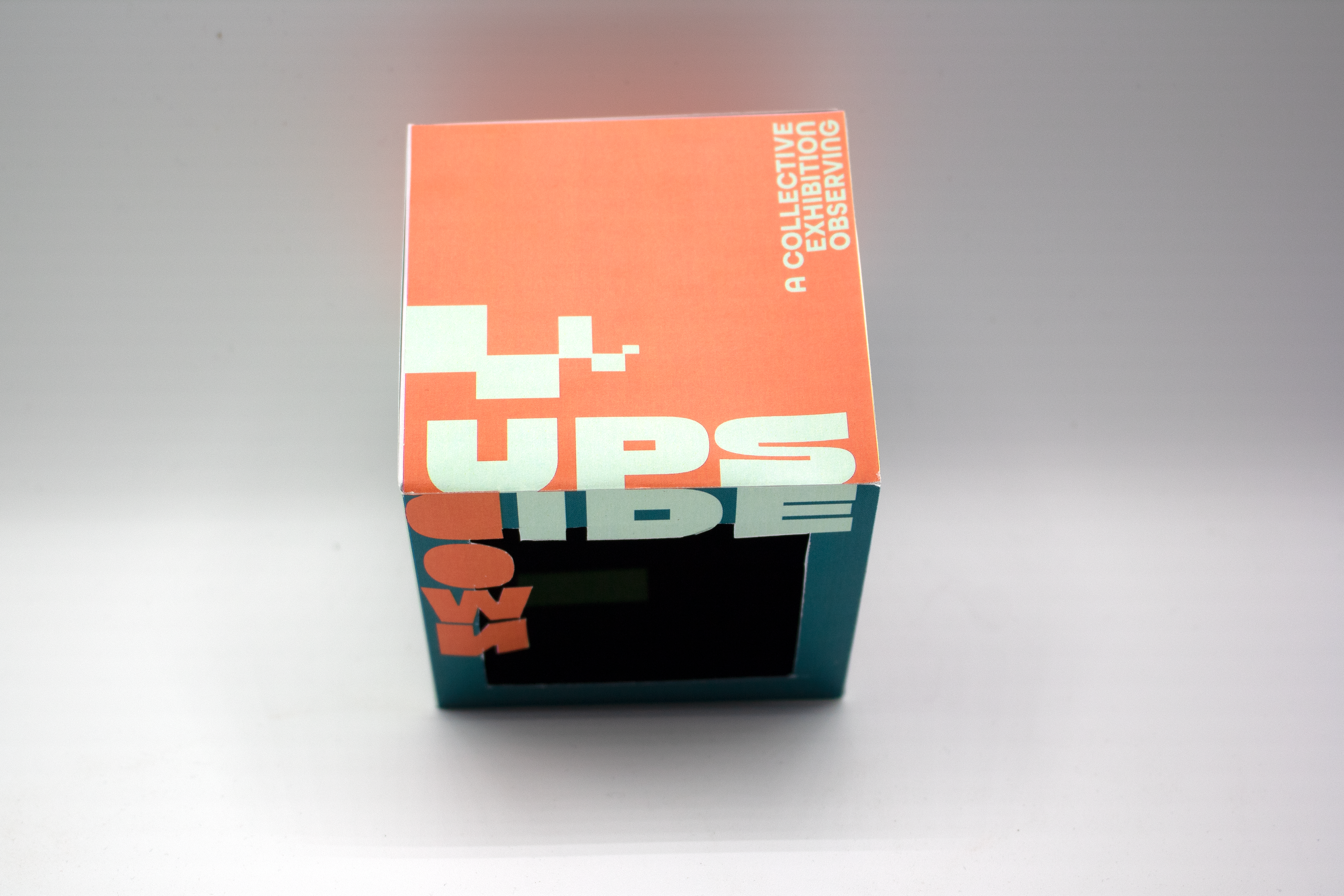
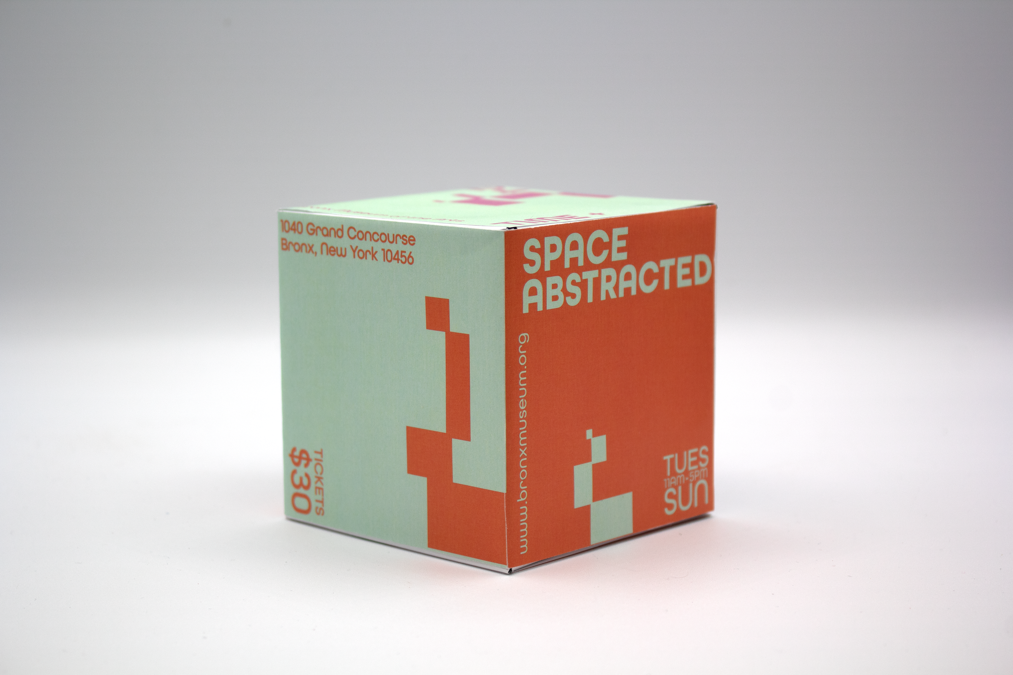
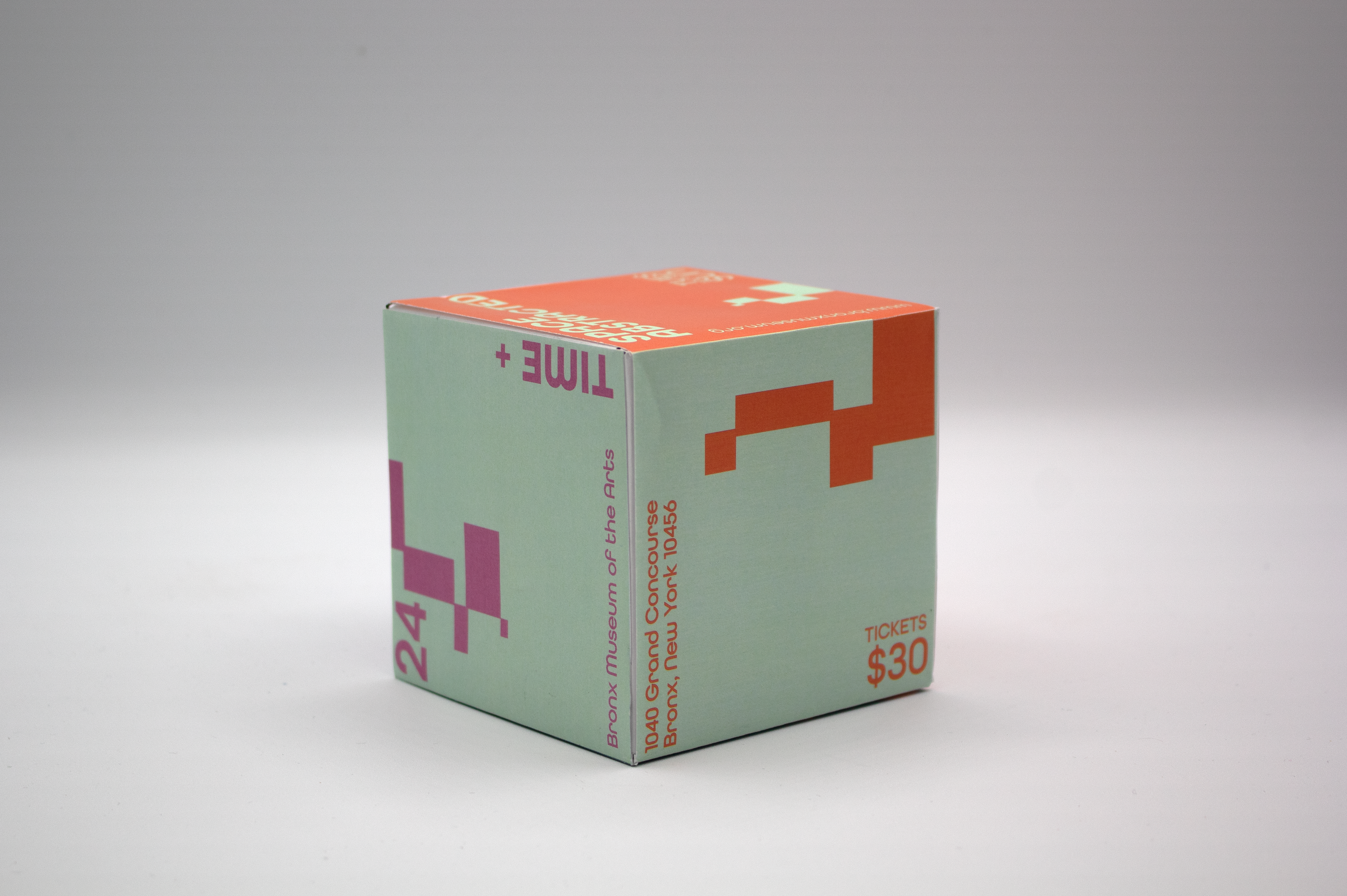
The previous flyer was applied to a 3D object to create a unique advertisement. The cube mimics the design from the previous flyer. The color of the shapes connects each side. On one side, there is a window that physically represents the inside out and upside down.